Beans & Brew

Beans & Brew is a case study I developed for the Google UX Design course.

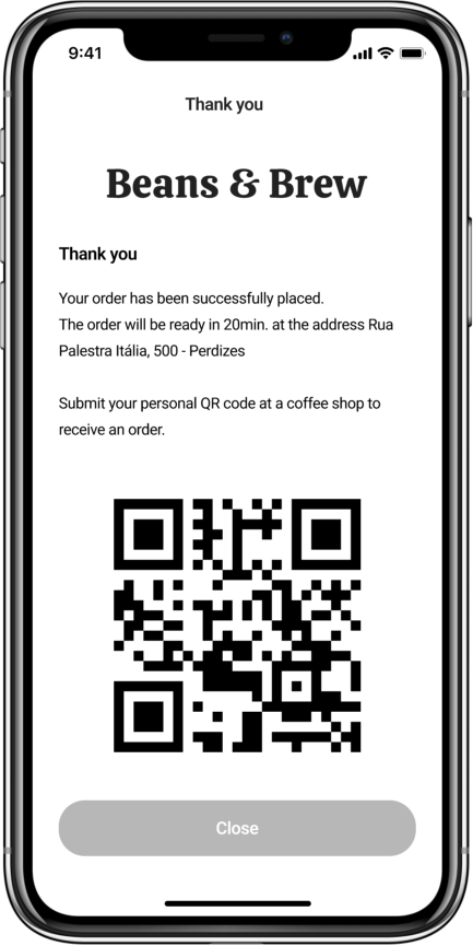
By placing the user front and center, I was able to understand their needs in the context of immediate coffee consumption—whether for pick-up or delivery—allowing them to enjoy their coffee promptly without long wait times for purchase or preparation.

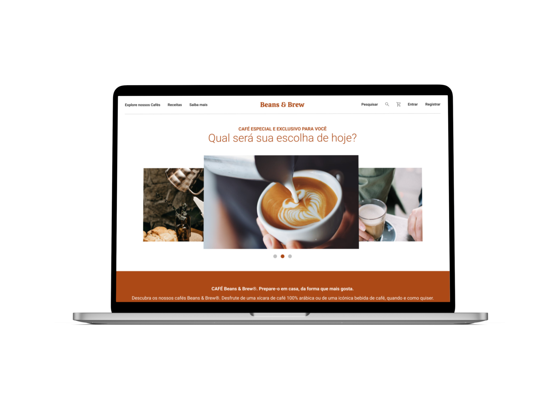
Additionally, I designed a responsive website for both desktop and mobile platforms, enabling customers to access information about products, preparation methods, and more.

I interviewed users and created empathy maps. The primary group prefers ordering specialty coffee for immediate pick-up or delivery due to its convenience and quick decision-making.

Problem Statement

Users want to find information on various types and make a purchase decision.

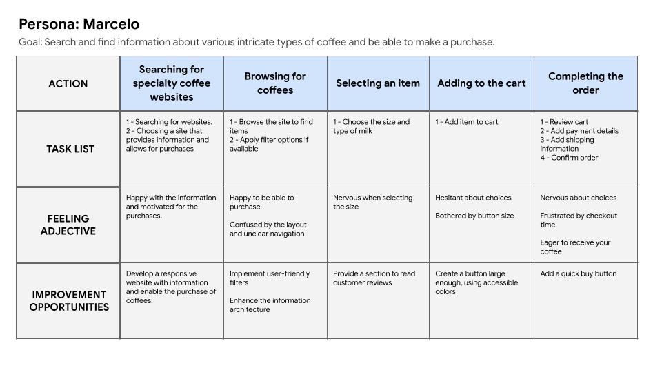
User Journey Map

The user’s journey highlights the need for easy access to information on different coffee types via a responsive website.

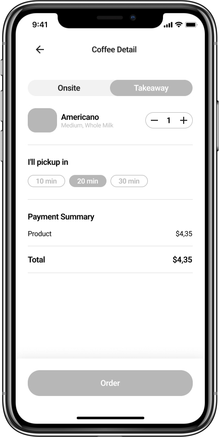
Paper Wireframes

The users would like to order coffee in the early morning, pick it up in advance, and enjoy it at work.

Digital Wireframes

As the initial design phase progressed, I made sure to base screen designs on user research feedback and findings.

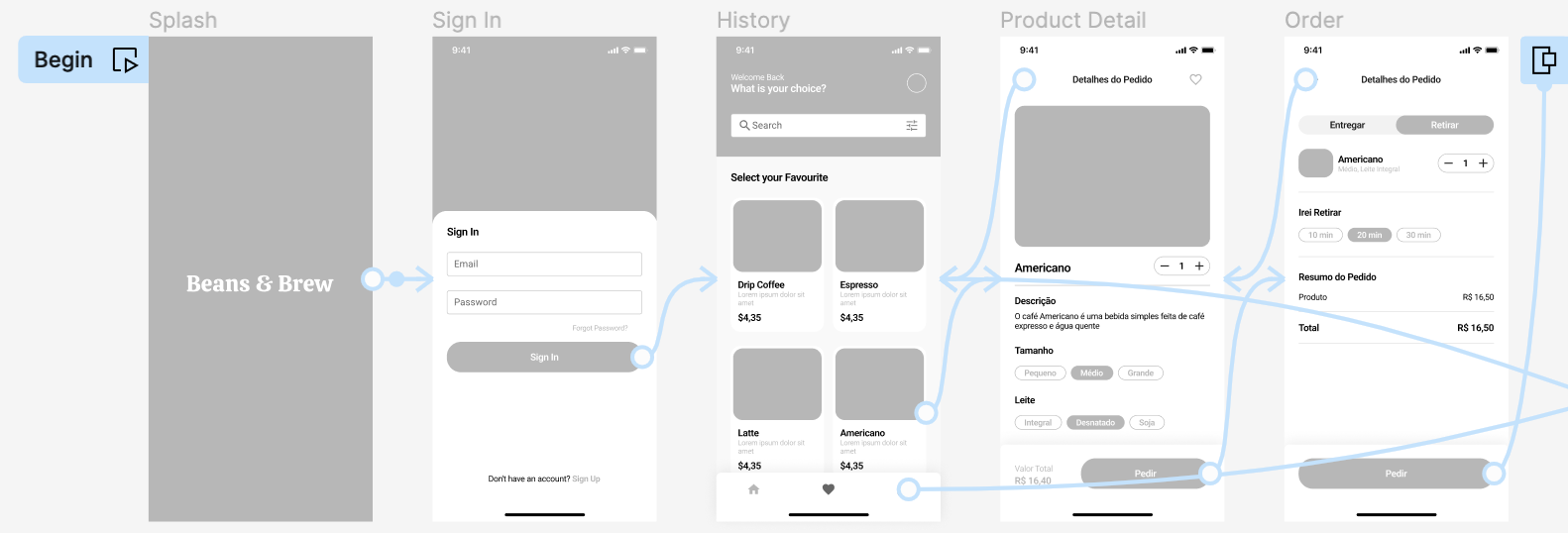
Low Fidelity Prototype

I created wireframes and developed a low-fidelity prototype. By mapping out the user flow, I connected the steps to visualize the entire process. This approach allowed for the execution of tasks such as selecting additional items and placing orders.

Outcomes
Impact

The app makes users feel that Beans & Brew genuinely cares about meeting their needs.
What the users say:

The app has made ordering so easy! I would definitely use this app as an option to place my coffee orders.

What I learned

When designing the Beans & Brew app, I learned that initial ideas for the app are just the beginning of the process. Usability studies and feedback influenced every iteration of the app designs.

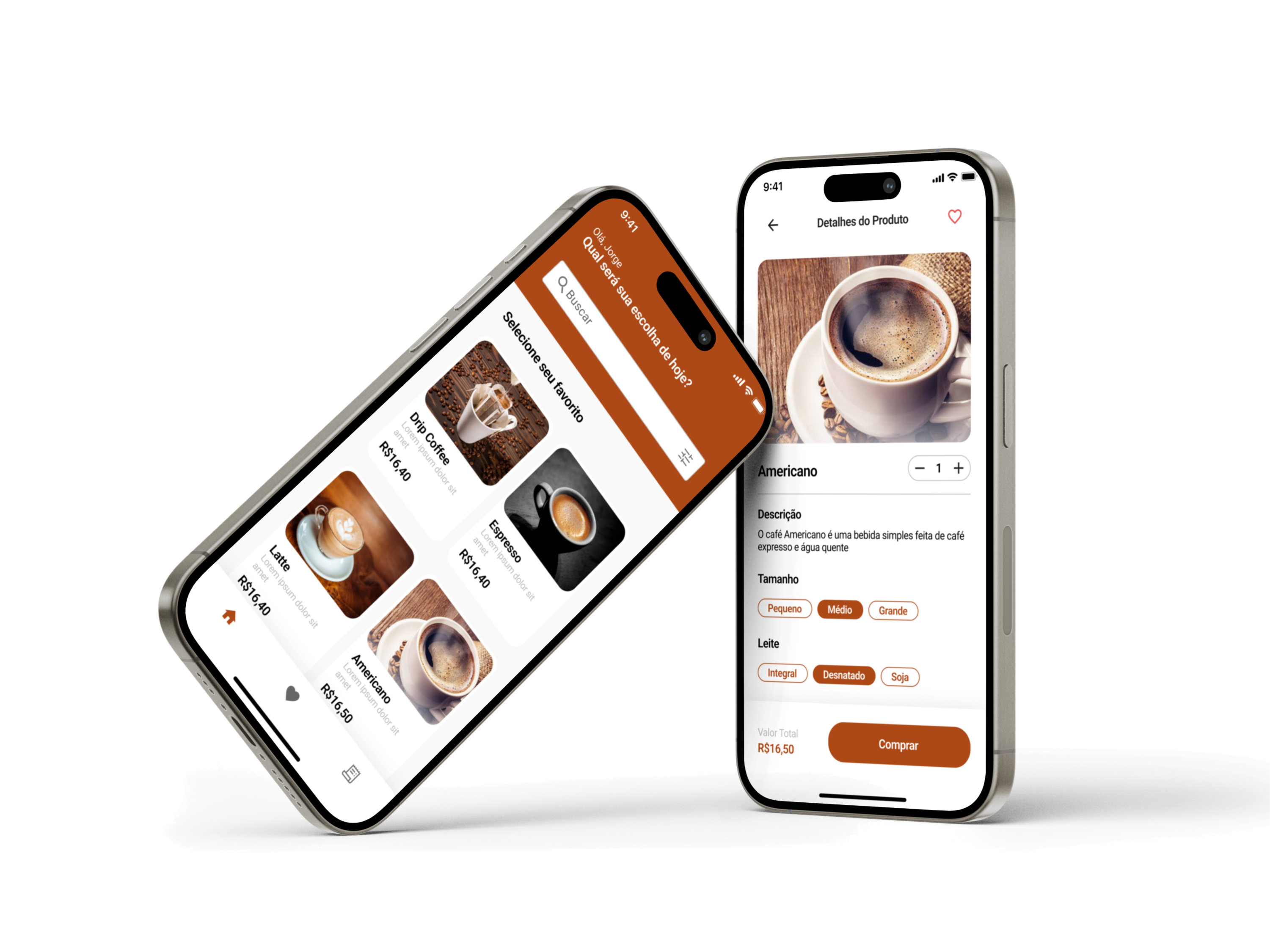
Mobile App
Responsive
Figma files

To see the whole work done in Figma, click on the links below:

Beans & Brew